Wednesday, 8 February 2017

Evaluation Question 4

Question 4 - How did you use new media technologies in the construction and research, planning and evaluation stages?

The majority of the media technology used within the research and planning stages of the task was based around the online program Blogger. Using Blogger was incredibly useful, as it meant that all of my personal research was available to me at instantly and accessible in any location as it was all saved online. This meant for example that if I needed a piece of work such as a shot list, it could easier be accessed by logging on to blogger at home. In addition to this, it made posting multimedia content a lot more efficient, as I could easily integrate video, pictures, graphs and text. However, a weakness of Blogger is the lack of ability to back up any work which is saved on it - this means that everything I had researched was at risk of being lost if the system was to fail. Also on multiple occasions Blogger was very prone to crashing meaning that the program had to be refreshed which was very inconvenient.

In addition to this, I used websites such as Slide Share in order to research the various theories and ideas which I would need to use in my work, such as the Andrew Goodwin's theory about the seven features which all music videos contain. When researching the history of music video, I primarily used Wikipedia, as this contained a large amount of useful information about which videos were the most popular over time and general information about different artist and bands. In addition to this, I was able to use YouTube to watch music videos over time so I could see how various generic conventions have been used within them. Overall, using various websites within the research and planning stage of the production of my music video helped me to create ideas about what to include in our own music video when we made it.


During the research and planning stage, we were required to make a lip-syncing video, in order to gain some practical work on using the filming and editing equipment. We used new media technology in the editing stage of this video, using iMovie in order to piece the shots together. We found when creating our lip syncing practice within iMovie was quite easy to use and also worked well in creating the final product. This was a useful task as it showed us the pros and cons of using iMovie, and led us to make the decision to use iMovie as the editing software for our final music video. In terms of my promotional package, I mostly used a mixture of Word and PowerPoint, which are both two unusual software’s to use to create an effective promotional package consisting of the magazine advert and Digipak for our music video. I had some experience with Adobe Photoshop, but I found that overall Word worked well for me and I used it effectively to create both the magazine advert and also the Digipak. New media technology was incredibly important in both researching and planning all of my products as it allowed me to find out a huge amount of new information, and to practise and perfect the skills which I began to develop during the final stages of the promotional package.
 
Construction - During the construction stage of both our music video and the promotional package, I used a number of both new technologies, and technologies which I already had some experience with. For the music video, the most important piece of technology which we used was the camera, which unconventionally we chose to use an iPhone 6s for the whole filming of the video. The camera itself had excellent portability and had a very well equipped interface and resolution for such as small device., which made it easy to create a strong depth of field within certain shots of our video. 

As a lot of our video was filmed in the during day time hours, having DSLR camera was necessary for our music video as the iPhone 6s was able to get 4K quality or what we used which was 1080p 60fps.
However, the camera also had some weaknesses which slightly hindered the production of our video, as the battery life was fairly weak with a maximum capacity of around 60 minutes in the resolution we used. This meant that we had to vastly limit the length of time which we could shoot for in a single day, although the limited battery life did help us as it forced us to be more efficient when choosing what material to shoot. In addition to this, the camera filmed onto an internal memory inside the phone, meaning that when it came to editing it toke no more than 2 minutes to transfer the clips from the apple device to the iMac.


Another important piece of hardware used for the construction stage of our music video was the iMac which we used as a workstation for our editing. This computer was chosen because of its larger screen than most computers have (27 inches) and also it was very quick and efficient when it came to editing in iMovie. This made it perfect for running both iMovie and other software’s we needed to run at the same time. We chose to solely use iMovie as we both had a lot of experience using the editing software and also was very efficient in the tasks that we needed to do on the software. Specific features which we used from the software include iMovie's precision editor in order to assist with our lip syncing and also the stabilising tool to help make all of our clips look stable. It was important that we used a Mac to edit our footage on, as using a Windows PC would severely hinder the quality of editing software which we had available to us. 

We used YouTube heavily during the construction aspect of the music video, as it allowed us to upload parts of our video which we could send to members of our target audience to immediately gain feedback. This was incredibly useful as it meant we could make quick changes to the video and without having a platform like YouTube then we would have to wait long periods of time for our target audience to watch our video on the iMac, which is very time consuming. In addition to the construction of the music video, I also used a variety of hardware and software in the construction of my Digipak and magazine advert. We actually used an iPhone 6s in order to take the pictures for our products. 

This worked well as it was easy to use and also very portable meaning that we could get shots within tight spaces that are larger DSLR camera which wouldn’t be able to do. We edited the images using Microsoft Word, an unconventional program that worked for our needed well.
It was good to use a program like this as it allowed us to produce our products with a surprising amount of ease and was able to access the products in many different locations such as at home, as the program is very commonly used. Overall, I believe that we used new media technologies relatively well during the construction process of our music video, although our one shortcoming was that we didn't experiment enough with the equipment and some of the software we used, which could have allowed us to produce an even more imaginative and memorable music video and promotional products.

Evaluation-
When putting together my evaluation, I used a variety of multimedia technologies to present my conclusion in an exciting and invigorating way. Similar to the research and planning stage, I used Blogger in order to present my findings using multimedia, for example in this post, where I have been able to seamlessly integrate text and images to back up my points. Using Blogger also means that I have been able to edit my evaluation as many times as necessary, whereas if I had been
evaluating the task on paper, I would have had to continually redraft until I had a document which I was happy with the standard of. Another media technology which I used within my evaluation is Emaze and Prezi, which are online presentation creation software. It allowed me to answer questions in a much more imaginative way. In addition to this, many find Prezi and Emaze to be a more engaging way of displaying information than just pure text, as like Blogger it has capabilities for the user to embed a wide range of multimedia. To conclude, I believe that I used new media technologies to their full extent during the research, planning, construction and evaluation stages of producing my product.

Saturday, 31 December 2016

Asking Permission from a record company

Asking Permission from a record company;

We are aware of needing to request permission to use the song from the artists record label. Below shows the content of an email that asks permission to use the Coldplay song 'Clocks'.

To whom it may concern, (Parlophone)

We are currently studying music videos in A Level Media Studies and as part of our coursework we have to produce a music video for an artist. We would like to request that we use Coldplay's 'Clocks' for the music video we will create and edit as we feel it lends itself well to a A level project.
We would ask for permission to be granted for this.
We can be contacted through our teacher at the school - gwillcox@chelmer.essex.sch.uk

Many thanks, we look forward to hearing from you

Josh Breeze and Nathan Copping
(A Level Media Students at Chelmer valley High School)

Tuesday, 27 December 2016

Key Connventions of Muisc Videos


Pop-

·         Characters seen in pop music videos are essential to the overall appeal of the video. They are stereotypically seen as happy and portrayed to be enjoying life; they wear fashionable, stylish and mainstream outfits.

·         Camerawork isn't specific to any genre however, in pop music videos loads of different shots are used such as long-shots and close-ups of the artists. At least two different shots need to be used to create the correct feeling and appeal to a larger audience.

·         Iconography is a use of visual images and symbols to associate things to the different genres. Pop music videos tend to just focus on one thing or character throughout the whole video.

·         Lighting in pop music videos are always the same whether they are male of female; they use unnatural, high-key lighting to gain positive vibes and feelings towards an artist. The high-key lighting is usually balanced out by small amounts of low-key lighting.

·         Narratives- There are three main styles of narratives for this genre of music; elaborate, farfetched or a love story. These narratives are usually very different and change according to the lyrics. Stories are told through the characters actions.

 Alternative Rock-


·         Lighting- Natural and Low-Key lighting are the two types of lighting that is mostly associated with music videos in this genre which allows for scenes to take place in locations such as clubs/ alleyways/ dark rooms etc. especially at night time although High-Key lighting is sometimes used when the convention is being challenged.

·         Camerawork- Various camera shots are used during Alternative Rock videos especially on the band members, shots include: Close-ups of band members and their instruments, Long shots of the entire band, hand held shots, POV shots, establishing shots of the scene etc.

·         Narratives- As most Alternative Rock videos have some portion of their videos based on a story, a narrative is normally based on messages such as bad pasts/pain/suffering/generally negative issues which all have a silver lining so the narrative depicts both the bad and good side of a situation,

Friday, 23 December 2016

Plan for magazine advert Part 2

Magazine Poster Draft 2; 


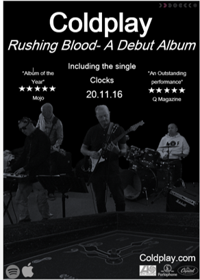
After my initial research into the Pop Rock genre, I designed a second magazine poster that uses typically seen generic conventions within the genre as well as other elements that would appeal the genre target audience to the the poster. 

How will this draft help me?
By producing the second draft, it has helped me with knowing more about the overall pop Rock genre, as well as seeing the elements and generic convention that are typically found. This will allow me to incorporate some of this generic connections into some of my other work such as my digipak as well as my actual music video. 

Monday, 19 December 2016

Plan for magazine advert Part 1

Magazine Poster Draft;


After researching around the Pop Rock genre, I designed an initial magazine poster that uses typically seen generic conventions within the genre as well as other elements that I feel would appeal to the typical target audience of the genre. 

How will this draft help me?
By producing the first draft, it has helped me further my knowledge about the overall pop Rock genre, as well as seeing the elements and generic convention that are typically found. This will allow me to incorporate some of this generic connections into some of my other work such as my digipak as well as my actual music video. 

Thursday, 15 December 2016

Analysis of magazine advert from chose artist

Analysis of magazine advert from chose artist;


The overall look of the advert is very different to what is typically seen from Coldplay. this gives a different perspective on the band and gives their target audience something that they haven't seen before, this could potentially make people more drawn to buy and listen to the album. 

The adverts shows the band's record label, advertising them to people who like this music.

The title of the album matches the colour scheme and overall look of the picture backdrop of the advert, helping to make the advert more appealing to the audience.

The band isn't seen at all on the magazine advert, which shows that the band are established enough that the name is enough for their target audience to buy and listen to the album.

How will this analysis help me?
Analysing this magazine advert will help me when making my own, as it has shown me what needs to be included within my magazine advert and also helps me to picture my digipak as bands typically use the same concept/ images on them to create synergy and a connection between the two. 

Sunday, 11 December 2016

Magazine advert analysis 2

Magazine advert analysis 2;


Plan B- The Deflation of Strickland Banks;

The Artist has used the same colour scheme throughout the magazine advert and also the digipak for the "Defamation of Strickland Banks" album. This creates a synergy between the magazine advert and the Digipak. This advert doesn't show any of the songs that are on the album. This shows that people ae not going to be attracted by the songs n the album but actually by the artist himself.
The adverts does show the artists record label, which would advertise and attract the band to people who like the record company’s music. The title of the album matches the colour scheme of the picture above it, helping to make the advert more appealing to the audience. Also the artists stage name "Plan B" is in a substantial size and is a completely different colour (red) to the background of the magazine advert. This is done to attract people who like the artist music and to make the name stand out. The simplicity of the overall magazine advert makes it appealing to the audience as the advert gets straight to the point and the audience know who and what is being advertised instantly. 
How will this help me when making my own Magazine Advert? 
Analysing this magazine advert will help me when making my own, as it has shown me the value of including the same image for the advert and the digipak to create a sense of synergy.


Monday, 5 December 2016

Magazine advert analysis 1

Magazine advert analysis 1;


Kasabian- Debut Album;


The band has used the same main image as in their album cover to evoke a sense of synergy between the two products. This means that someone, after seeing the advert, will easily recognise the album. This advert shows some of the songs that are on the album. This helps to attract customers who heard and liked the songs when they came out as singles. The adverts don’t show the band's record label, which would advertise and attract the band to people who like the record company’s music. But as there is no record label on the advert, this is not possible. The title of the album matches the colour scheme of the picture above it, helping to make the advert more appealing to the audience. The band is well advertised as you can clearly see the name at the top of the page in white text on a black background.The simplicity of the overall magazine advert makes it appealing to the audience as the advert gets straight to the point and the audience know who and what is being advertised instantly. 

How will this help me when making my own Magazine Advert? 
Analysing this magazine advert will help me when making my own, as it has shown me the value of including the same image for the advert and the digipak to create a sense of synergy.

Friday, 2 December 2016

Plan for Digipak 2

Plan for Digipak 2;


This is our second design for our Digipak for our band. We have used Coldplay as our replica band (as seen on our first plan) as we will be using "Clocks" for our own music video. However, the images will be changed when we film our band and then use them in this digipak. We will also change the name and album title as we have currently used Coldplay and this will stop any copyrights being breached. 

How will this help me?
When it comes to making our final Digipak, this first plan will help us greatly as we can combine ideas currently being used and also our own ideas. This will help make our final ideas and also design much better then not planning before. 

Tuesday, 29 November 2016

Plan for Digipak 1

Plan for Digipak 1;


This is our first design for our Digipak for our band. We have used Coldplay as our replica band as we will be using "Clocks" for our own music video. However, the images will be changed when we film our band and then use them in this digipak. We will also change the name and album title as we have currently used Coldplay and this will stop any copyrights being breached. 

How will this help me?
When it comes to making our final Digipak, this first plan will help us greatly as we can combine ideas currently being used and also our own ideas. This will help make our final ideas and also design much better then not planning before. 

Sunday, 27 November 2016

Analysis of Digipak from Chosen Artist

Analysis of Digipak from Chosen Artist;


This digipak is from a different album to the magazine advert that i previously analysed, so no synergy was used within this digipak. 

On the front of the album, there is no sign of the the record label or any of the songs that are included on the album. This is unusual as both these generic conventions are typically shown on the cover, but this may have been done to make the album seem simplistic and uncluttered.

On the back of the digipak there is the full song list that is included on the album, which gives the indication to the consumer buying the album which songs are included and which are not. 

Down the spine of the digipak, it includes the record label and other bits of information that are needed on a digipak. Also it includes the bar code and also the logo of the record label.

The name of the alum is sown on the right side on the front of the digipak, so that the artwork in the middle is covered up. Also doesn't stand out, which makes the artwork stand out and is what makes people attracted to the album. 

The artwork on the front is very prominent as Coldplay currently uses this logo throughout their advertisements, so this is quite known, which means that the band doesn't need to add there name and faces to the cover to make consumers know which band the album belongs to.

What have i learnt from this analysis?
From this analysis i have learnt what elements are needed within a digipak to keep the the overall concept appealing and attract the the appropriate target audience. As well as this, it also gives me a rough guide on what needs to be included on my own digipak, so it keeps in sync with my genre. 

Thursday, 24 November 2016

Digipak Analysis 2

Digipak Analysis 2;


An example of a Digipak in current use is Demon Days by the Gorillaz. Many other artists are using Digipaks and they are more or less taking over as the norm. What is different about the Gorillaz Digipack is that it folds in different ways that the usual sideways fold. it folds from all sides in a quite unique way to show each cartoon character which is meant to represent each band member. By doing this differently it stands and changes the conventional side ways opening digipaks. 

This is an unconventional approach to a digipak as each of the band member is interpreted by a 'cartoon' version of themselves, rather than letting everyone become aware of who they really are or showing the identity of the band members on the digipak. As all of the character head-shots are over a white background it really makes them stand out especially with the fact that they are all represented by cartoon characters. As the bottom side of the digipak isn't shown within the picture or be found from research into the digipak, from generic conventions, this could be where the songs are shown that are on the album as this is where they are generally shown. 


How will this help me with my digipak?

By doing this analysis it will help me when it comes making my own digipak as like my previous analysis it gives me ideas for the overall digipak. Also it will help as it gives me and indication on what needs to be included within a digipak in this genre, which I can then apply to my Pop Rock genre as these genres are very similar.  

Wednesday, 23 November 2016

Digipak Analyis 1

Digipak Analysis 1;


This Digipak is by Kings of Leon. The overall theme to their album is an owl like bird, which is shown on the front and also the back of the digipak. This is quite an artist design and also unique compared to similar bands digipaks, as it incorporates the bands faces with the owl itself. This fits in with their genre which is rock as the colours are very dark and mysterious. On the inside there are individual portrait shots of each of the band members, which gives a clear view on all of the members as the initial photo has been edited to incorporate the owl. There are no special effects or posing by the artists, as these photographs are used to clearly show the band members not to disfigure them. There disk design used is also is coloured to fit in with the overall album design, which continues the overall theme within the digipak.
On the front cover of the album the initial title is very discrete and is very hard to see unless focused on and also the fact that it has been put in the top right hand corner. This adds to the overall feel of digipak, where the band themselves want their audience to focus more on the design of the album and also to initially recognise their band members from the pictures, as they are a well-known band. Their songs on the back cover are again very small and out of the way, this is emphasising their overall look that they want to create wanting to be unique to other artists within the genre. 
How will this task help me with my Digipak?
By doing this analysis it will help me when it comes making my own digipak as it gives me ideas on what i can include within my digipak. Also it will help as it gives me and indication on what needs to be included within a digipak in this genre, which i can then apply to my Pop Rock genre as these genres are very similar.